Retirement Financial Plan Report

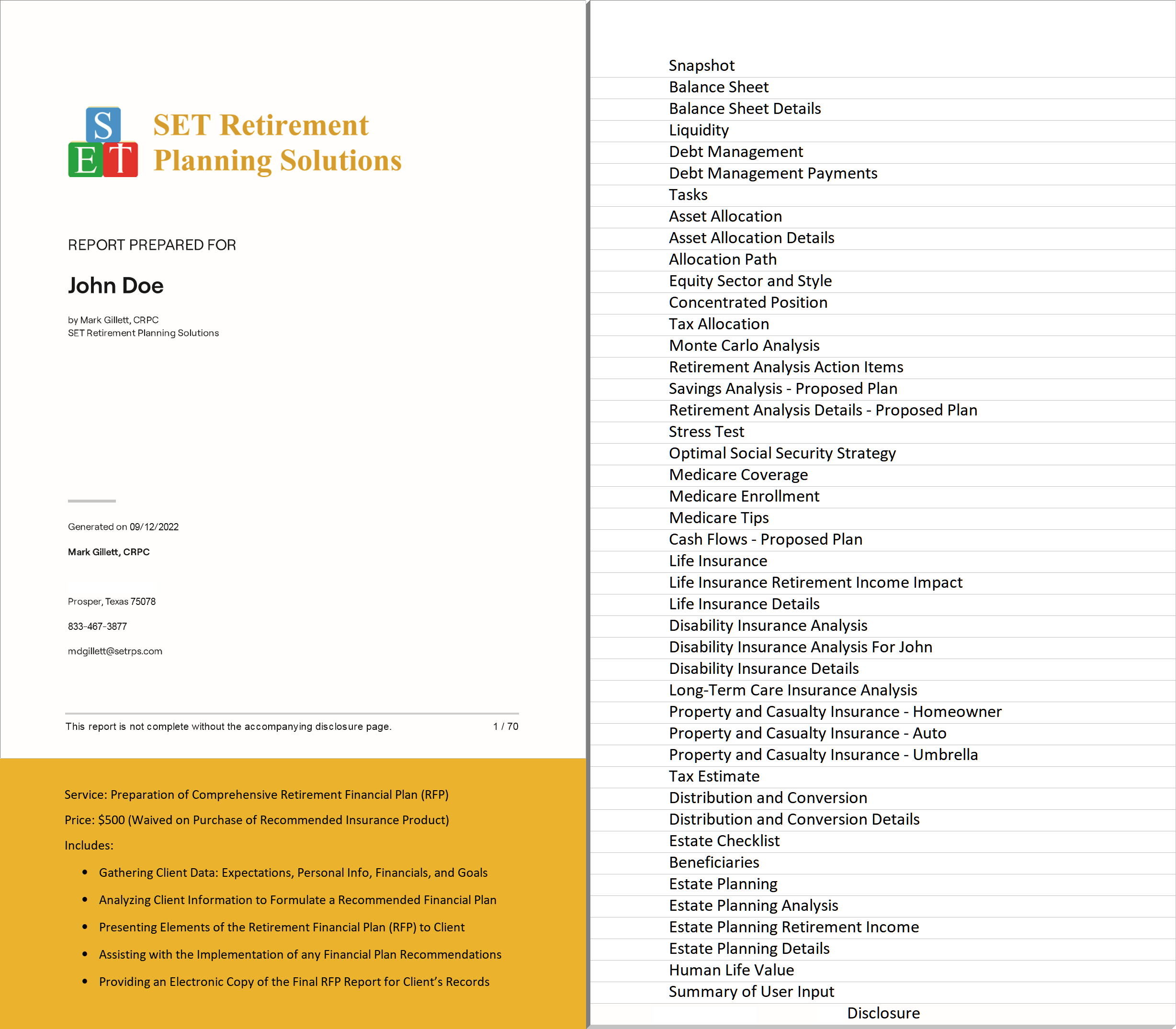
SET Retirement Planning Solutions utilizes RightCapital Planning Software to produce detailed Retirement Financial Plan (RFP) reports for our clients. Click on the sample RFP Table of Contents below to view a sample full RFP Report.

Retirement Financial Plan Analysis

In addition to producing static Retirement Financial Plan reports, SET Retirement Planning Solutions also allows our clients to perform real-time online analysis of their Retirement Financial Plan, including the capability to try "what-if" scenarios.

In the online account, access the Analysis menu by navigating to Retirement > Analysis. Within the Analysis menu, there are five tabs: Probability, Confidence, Comparisons, Savings, and Retirement Details.

Screenshot of the financial plan Retirement Analysis menu

Retirement > Analysis: Probability Tab

The Probability tab reflects the results of a Monte Carlo simulation of 1,000 trials. Specifically, probability of success demonstrates the percentage of time in the 1,000 trials the client's plan does not run out of money in any year. Even if the simulation registers assets remaining in the last year of the plan, the overall probability of success will decrease if there are any years in which the simulation reports $0. The analysis uses 80% as a standard guideline for a reasonable probability of success. The value in the green bar reflects the median investment asset value at the end of the plan across the 1,000 trials (the Confidence tab also shows this value).

Screenshot of the financial plan Retirement Analysis Probability tab

Action Items
dynamically adjust variables to create an on-the-fly new plan. Click Refresh to see the impact of changes to these variables. The changes will be reflected in the Proposed Plan area, while the data in the client's Profile will be reflected in the Current Plan area:

Screenshot of expanded Action Items for Retirement Analysis Probability


The Future dollars / Today's dollars toggle allows you to display dollar values in two different ways:

Screenshot of Future dollars / Today's dollars toggle

"Future" dollars illustrate the real projected dollar value in future years, factoring in all growth, inflation, and annual increase rates. Given those assumptions, this represents the actual future projected dollar value.

"Today's" dollars illustrate the real current dollar value by discounting the values calculated in the future dollar calculation by the general inflation rate that has been set. This gives a better context for the values shown by reflecting them in today's inflation environment.

Live screenshot showing comparison between Future dollars and Today's dollars setting


Retirement > Analysis: Confidence Tab

The Confidence tab reflects the range of outcomes of the Monte Carlo analysis throughout the projection. Consequently, a client's assets will most likely fall somewhere in one of the blue shaded areas. Moreover, the lightest blue area covers the widest range of possibilities, which means that there is a high degree of confidence a client will land somewhere in that range (90% of results). But it can be hard to plan a lifestyle around such a large bandwidth! The dark blue area is still likely and easier to plan around (50% of results). The solid blue line is just the median - possible, but likely not exact.

Screenshot of the financial plan Retirement Analysis Confidence tab

At each age (reflected on the x-axis), the 1,000 Monte Carlo results for that point are ordered by asset value. Therefore, the simulation providing the lowest asset value would be listed as "result 1" and the simulation providing the highest asset value would be listed as "result 1,000".


5%-95% Confidence Level

The 5%-95% Confidence Level excludes only the highest and lowest 5% of the values. So, the light blue shaded area in the confidence graph reflects Monte Carlo results in the 51 - 950 range (in asset value order). To clarify, this means that 90% of the time, a client's assets will fall somewhere between the upper and lower boundary of the light blue area.


25%-75% Confidence Level

The 25%-75% Confidence Level excludes the highest and lowest 25% of the values. So, the dark blue shaded area in the confidence graph reflects Monte Carlo results in the 251 - 750 range (in asset value order). To clarify, this means that 50% of the time, a client's assets will fall somewhere between the upper and lower boundary of the dark blue area.


Median Confidence Level

The median Confidence Level excludes all higher and lower values. So, the solid blue line in the confidence graph reflects a Monte Carlo result of exactly 500 (in asset value order). To clarify, this means that 0.1% of the time, a client's assets will fall on the solid blue line.

Retirement > Analysis: Comparison Tab

The Comparisons tab compares projections for different plans across various Return Scenarios. There are four different graphs in this comparison. Correspondingly, use the dropdown above the graph to switch between these different graphs:

  • Invested assets (initial view): only compares the value of invested assets (excludes other assets) through the Plan duration
  • Net Worth: compares the client's estimated net worth (all assets and liabilities) between plans
  • Taxes: displays a comparison of the client's estimated tax burden throughout the end of the Plan
  • Assets at Retirement: shows a bar graph comparing estimated assets at the beginning of total retirement

Screenshot of the financial plan Retirement Analysis Comparison tab

You can also use the dropdown box on the right side of the graph to adjust the Return Scenario for calculating the above-listed values. For example, selecting the Baseline scenario reflects the straight-line projection based on the client's asset allocation for the plans displayed. Secondarily, there are also four other pre-built Return Scenarios:

  • Bad decade followed by slow growth
  • Fed adversed scenario followed by modest growth
  • Strong growth scenario
  • Flat 0% return

Retirement > Analysis: Savings Tab

The Savings tab illustrates the benefits of proposed savings strategies during the client's accumulation phase. Specifically, this area includes four graphs that reinforce the importance of growing a portfolio to sustain cash flow needs in retirement. The savings tab will analyze details from the proposed plan listed on the left side of the Retirement > Analysis > Probability Tab. Select each graph using the dropdown menu above the graph:

  • Current year savings
  • Savings over time
  • Savings rate
  • Total savings and returns

If either client or co-client has retired, only the current year savings graph will be available.


Current year savings

Screenshot of the financial plan Retirement Analysis Savings tab showing Current year savings graph

This graph illustrates the investment contributions in year one of the financial plan. Furthermore, the graph groups the current year's savings into four buckets:

  • Taxable account savings
  • Retirement account savings (including 401(k)s, IRAs, Roth IRAs, etc.)
  • Education account (529) savings
  • HSA account savings

Retirement savings and HSA savings will include both employer and employee contributions. Also, the right side of the graph lists the Total annual savings and Savings rate.


Savings over time

Screenshot showing Savings over time graph

This graph illustrates investment contributions each year until the first client retires. Furthermore, it differentiates savings by "bucket of assets" identified in the current year savings graph. Also, the right side of the graph lists the Total savings and Average savings rate. Total savings represents additional contributions made on top of the net worth values in the profile tab.


Savings rate

Screenshot showing Savings rate graph

This graph illustrates the percentage of income saved each year until the first client retires. To clarify, the savings rate percentage for each year is calculated as the total savings divided by the total income. Also, the right side of the graph lists the Total savings and Average savings rate. Total savings represents additional contributions made on top of the net worth values in the profile tab.


Total savings & returns

Screenshot showing Total savings and returns graph

This graph demonstrates how the client is projected to reach their accumulated assets at retirement. It shows the current portfolio value, total employer/employee savings, and cumulative portfolio return for each year until the first client retires. Also, the right side of the graph lists the Total invested assets when the first client retires. This graph illustrates total savings and portfolio returns associated with a baseline growth assumption.

Retirement > Analysis: Retirement Details Tab

The Retirement Details tab offers three graphs to demonstrate retirement income, withdrawals from invested assets during retirement, and total retirement spending. Use the dropdown menu above the graph to select the appropriate view.

You can also use the dropdown box on the right of the graph to adjust the Return Scenario. For example, selecting the Baseline scenario reflects the straight-line projection based on the client's asset allocation for the plans displayed. Secondarily, there are also four other pre-built Return Scenarios:

  • Bad decade followed by slow growth
  • Fed adversed scenario followed by modest growth
  • Strong growth scenario
  • Flat 0% return


Income Sources

Screenshot of the financial plan Retirement Analysis Requirement Details tab showing Income sources graph

This graph illustrates the client's retirement income sources breakdown across the selectable Return Scenarios mentioned above. Mouse over the graph to see the specific income amounts. The income shortage indicates the amount of funds not supplied by the plan. The % income is stable reflects the percentage of income coming from Social Security, Pensions, and Annuities.


Withdrawal Rate

Screenshot showing Withdrawal rate graph

This graph illustrates the percentage of investment assets withdrawn each year to fund retirement expenses across the selectable Return Scenarios mentioned above. Furthermore, this percentage will include any required minimum distributions and other withdrawals to fund net expenses.


Retirement Spending

Screenshot showing Retirement spending graph

This graph displays a breakdown of the household's expenses in retirement based on the following categories:

  • Retirement expense
  • Tax expense
  • Housing expense
  • Health care
  • Other

Use the Retirement > Analysis > Action Items > Retirement Spending dropdown menu to model different dynamic spending scenarios that impact the retirement spending graph above.

Screenshot showing Inflation Adjusted dynamic spending scenario selection

Retirement Financial Plan Stress Test

Besides producing Retirement Financial Plan reports and performing Retirement Financial Plan analysis, SET Retirement Planning Solutions also offers a tool for our clients to perform a Retirement Financial Plan stress test. This helps determine what happens to a plan if uncontrollable factors experience more dire realities than the plan projection currently includes. To access the stress test tool, navigate to Retirement > Stress Test.

Screenshot of the financial plan Retirement Stress Test menu


Retirement > Stress Test

There are many uncontrollable factors in the future. Consequently, the stress test tool identifies several of the common uncontrollable factors which often contribute to a diminished retirement lifestyle and models a stress test to determine a client's financial resilience to fluctuations in these factors.

Screenshot showing Stress test probability of success example

The Baseline column shows the current unstressed probability of success from Retirement > Analysis. Conversely, the other columns (Market drop immediately, Market drop at retirement, Taxes, Social security, Longevity, Inflation, Health care, and Asset return) reflect a stress applied to each individual factor (assuming all other factors are held constant). Mouse over the columns to see the exact probability of success for each factor.


Stress Test Setup

To apply a stress to a factor, open Action Items. The default factor stress settings are displayed. Then, create a unique stress test by setting the stress slider control for each of the corresponding factors. Once you finish adjusting the slider control(s), click Refresh and the tool will apply the indicated stress to each factor and re-run the entire Monte Carlo simulation to recalculate the plan's probability of success.

Screenshot of expanded Action Items for Retirement Stress Test


To choose which stress test factors you wish to display on the screen, click the Edit button to check or uncheck various factors:


Screenshot of pup-up for selecting stress test factors


Stress Test Details

Category Description
Equity markets drop immediately by Assumes an immediate drop in the equity portion of the client's investments by the percentage indicated. Subsequently, investments are assumed to grow as they would have in the Baseline plan, one year after the market drop.
Equity markets drop at retirement by Assumes a drop in the equity portion of the client's investments, at retirement, by the percentage indicated. Subsequently, investments are assumed to grow as they would have in the Baseline plan, one year after the market drop.
Asset return will be lower by Reduces variable investment returns by the percentage indicated across the board.
Inflation will be higher by Increases all inflation rates by the percentage indicated.
Tax expense will be higher by Assumes an increase in the total taxes paid by the percentage indicated.
Social Security will be reduced by Assumes a reduction in total Social Security benefits paid by the percentage indicated.
Health care cost will be higher by Assumes an increase in the total health care costs by the percentage indicated. This applies to costs specified in the Annual Retirement Health Cost and Annual Retirement LTC Cost cards.
You (and your spouse) will live Extends both the client and co-client's planning horizon by the number of years specified.
Combined The combined stress test reflects the cumulative impact of all of the other stress tests displayed in the graph. This allows you to select specific stressors and indicate their combined impact on the probability of success.


Stress Test Example

The graph below indicates a 78% combined probability of success. Specifically, this includes a reduction in social security, increased inflation, and a reduction in asset returns. Note that the Combined column is enabled by the Edit button within the Action Items.

Screenshot showing Stress test probability of success with Combined column example


Creating and Testing Multiple Plans

As you create multiple proposed plans, the stress test can be an excellent way to compare the resiliency of those plans in a variety of environments. Moreover, you can use the drop-down box in the upper right-hand corner of the stress test screen to select which proposed plan to stress test.

Financial Plan to Get Ready... Get SET!

We will produce, and give you online access to, a detailed Retirement Financial Plan for free. So, what are you waiting for?